This infographic was designed as an excercise to showcase a fictional publishing brand’s commitment to Young Adult (YA) literature. The goal was to guide aspiring YA authors and readers aged 13-19 through the exciting journey of publishing a novel with the brand.
Design Elements
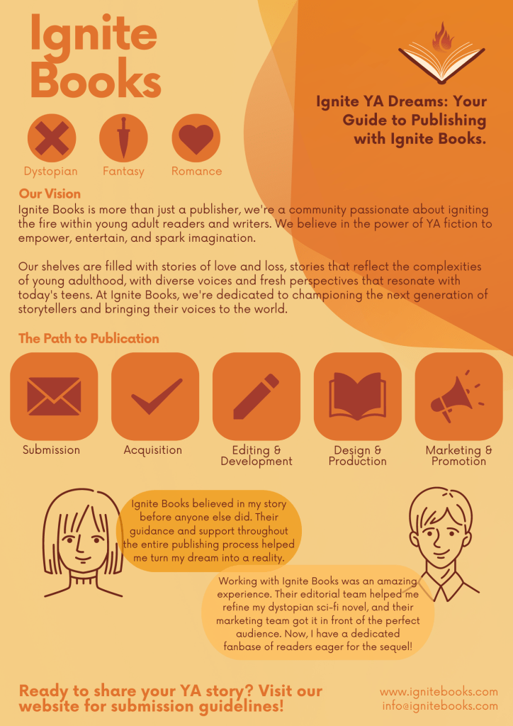
- Colour scheme: I picked vibrant and energetic colours (orange, yellow, dark reds) to appeal to a younger adult audience, while still feeling in line with the branding (a dark red book with a flame).
- Visual: Engaging illustrations and icons were used to represent different some of the popular YA subgenres that the publishing company might deal in, and icons for the publishing process, making the information more easily digestable.
- Font: I picked a simple, geometric, easy to read font (Now) to ensure reasability and compelement the overall design.
- Hierarchy: The infographic has a lot of text, so I made use of the visual ellements to seperate larger chunks of information.
Conetent Breakdown
- The YA Genre: Under the brand logo I featured an eye-catching breakdown of popular YA subgenres such as Dystopian, Fantasy, and Romance to give an idea of what types of genres are popular for this brand to work with.
- Brand Spotlight: Introduces the fictional brand’s values and dedication to YA fiction.
- The Path to Publication: Clearly illustrates the stages of publishing a YA novel, from the submission process to editing, design, marketing, and promotion.
- Success Stories: These highlight blurbs of fictional successful YA authors published by the brand.
- Call to Action: This encourages aspiring authors to submit their work, with a direct message and website link for submission guidelines, and an email adress in case they have any questions.
