I created this style guide for the Humanities POPcorner’s Instagram and Facebook to ensure a cohesive and professional presence on social media. This guide provides the essential elements that define our visual identity, helping us communicate our brand effectively and consistently.
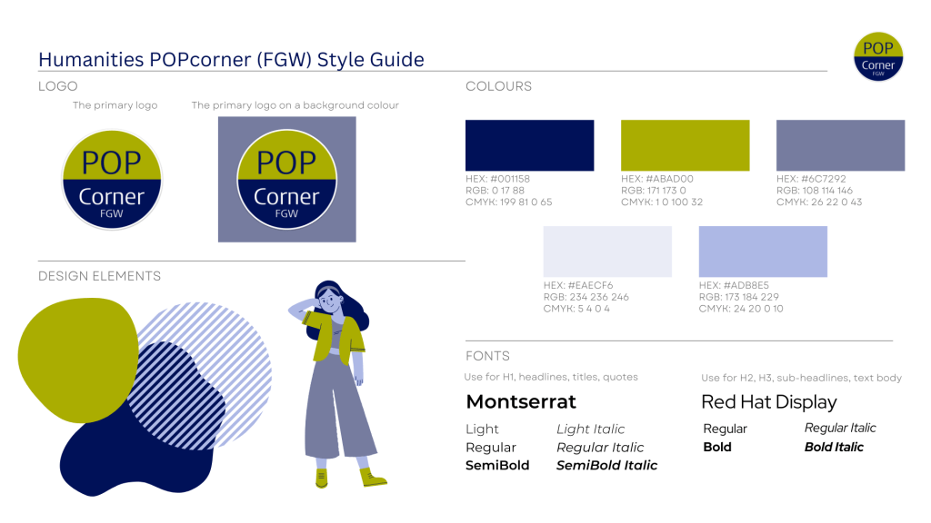
Logo
Our logo is the cornerstone of our brand identity, representing Humanities POPcorner with clarity and professionalism. It should be used thoughtfully to maintain brand integrity across all platforms.
Colours
I carefully selected our colour palette to reflect the dynamic and vibrant nature of Humanities POPcorner by combining the Humanities colour (#ABAD00) with colours that fit the university colour (#001158). Combined, these colours create a visually appealing and cohesive look.
Fonts
Typography is a key component of our visual identity since we share a lot of information. I chose the following typefaces to maintain a consistent and readable style:
- Montserrat
- Use for H1, headlines, titles, quotes
- Styles: Light, Light Italic, Regular, Regular Italic, SemiBold, SemiBold Italic
- Red Hat Display
- Use for H2, H3, sub-headlines, text body
- Styles: Regular, Regular Italic, Bold, Bold Italic
Design Elements
I incorporated the Corporate Memphis style into our design elements to give our visuals a modern and vibrant touch. This style features geometric shapes, bold patterns, and a playful use of colour, adding energy and dynamism to our content.
This style guide ensures that all our visual communications are consistent, visually appealing, and true to our brand. By adhering to these guidelines, we can maintain a strong and cohesive identity across all our social media posts and stories.
